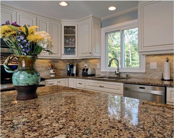
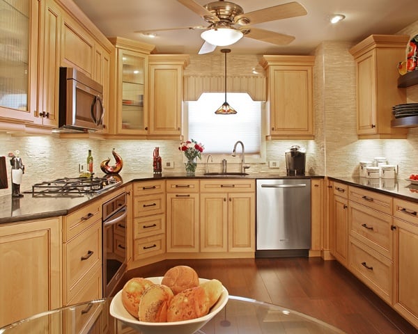
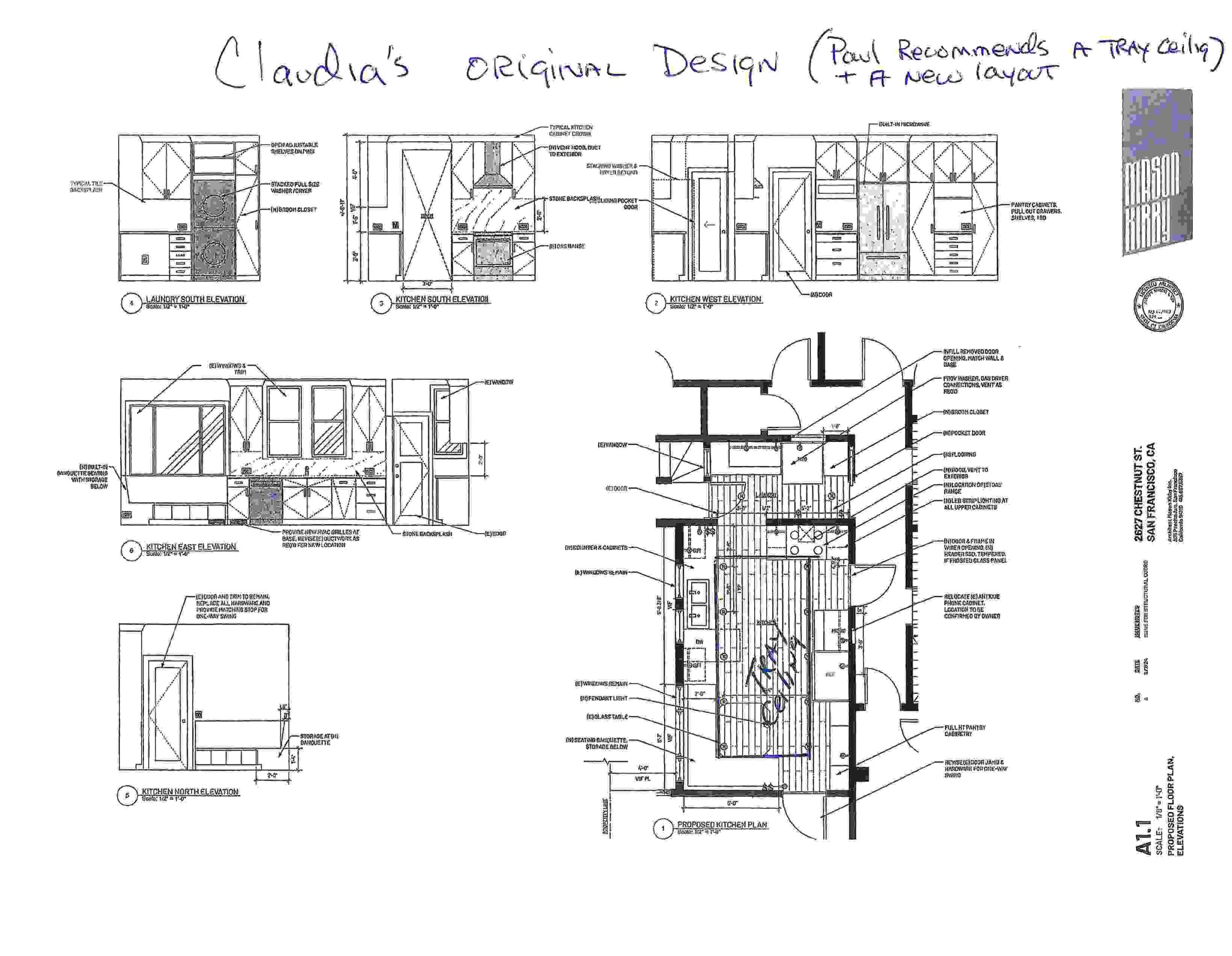
Imagine such a dramatic kitchen renovations that people looking at the before and after photos don’t even recognize the space?!
One funny example of this happened in 2015 when Main Line Kitchen Design entered a particularly dramatic kitchen transformation into a national design and renovation competition, The Chrysalis Awards. The Chrysalis Awards uses a 3 panel judging system and the winning kitchen is the one with the highest total.
The kitchen entered by Main Line Kitchen Design had already won regional competitions. Our submission included before, during and after photos of the renovation. We also included a detailed floor plan with measurements of before and after, and an in-depth description of the work done and the products used.
The winning kitchen in our category won with a total of 24 points. We were close with a total of 23 points.
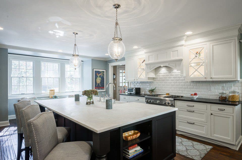
The after in our 2015 entry that didn’t win an award!
When we received the judges’ score cards, we got a big surprise.
One judge gave us a 10, a second judge a 9, and the last judge gave us a 4. His scorecard said that he did not believe the photos were from the same house. He could not follow the before during and after photos, plans and drawings, and recognize what any expert should. That while the transformation was dramatic, all the windows were in the same location and were the same width. Exterior dimensions were identical. Yes – a stairway had been moved and rooms repurposed but that was the genius of the renovation. How ironic that Main Line Kitchen Design designed such an impressive renovation that one judge was unable to understand what he was looking at.
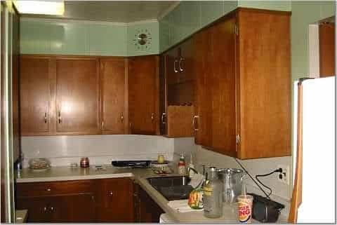

One photo of the before photos from the 2015 kitchen transformation that didn’t win The Chrysalis Award
The scale of the renovation in the kitchen below is similar. The changes are so extreme that only expert remodelers would understand that the before and after photos were from the same home.
Looking at the photo below, the wall to the left was removed. The side of the home with the original window and doorway was redone with a bank of windows. The kitchen sink was also moved under the windows, and the doorway was moved to the left of the left wall in the photo. This was all accomplished in a home with a stone exterior! This means that new matching stonework was done on the outside, complete with a new side stoop and railing.


The long wall below is where the range is now relocated. A far better wall for a range than a sink.


The 5 foot long wall facing us below is where the ovens and the column refrigerator were relocated to. Notice the hallway in the middle with two steps up is visible in both the before and after pictures.


After removing the wall to the right, the pantry space was put along the wall. The basement door (just visible through the doorway on the right) was covered in matching wood. This blends into the kitchen cabinetry.


The completed kitchen is below. Can you look at the before and after photos, and recognize that this is the same home?


Don’t feel bad if you find it difficult. The hallway and steps just visible center are one give a way. And, the basement door finished in matching wood also helps with recognizing the space.
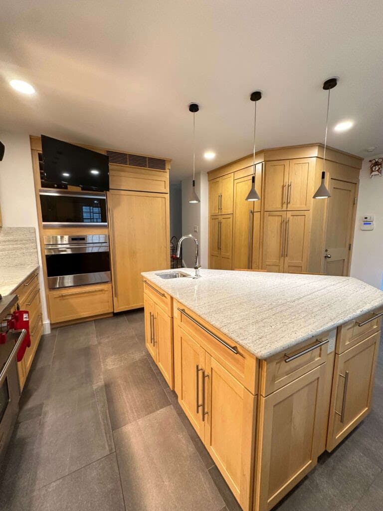

This kitchen was the collaboration between Paul and a talented local architect who was renovating his own home. If you’ve listened to our podcast (Calls with Paul: The Kitchen Design Podcast) you know that Paul and architects can be a bad mix. However, this talented architect gets 5 stars from Paul, not just for his kitchen, but for the other renovations around his home. His master bath is equally dramatic.
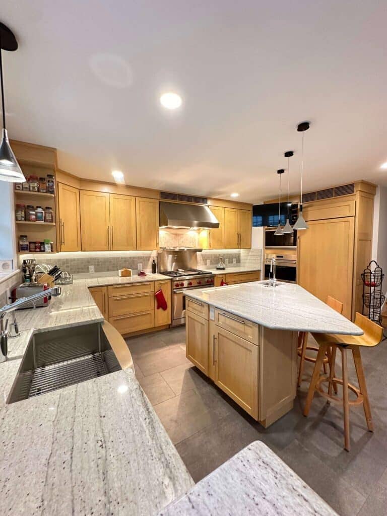

Paul and the architect/homeowner didn’t agree on every aspect of the renovation – that is actually never the case in any successful remodel. The best decisions are made when everyone in the process is open minded and collaborates. As Paul’s wife Julie says “the best collaboration is when one and one makes three!”
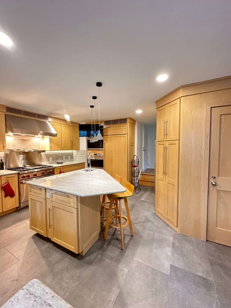

Main Line Kitchen Design hopes these before and after photos showing just how creative kitchen transformations can be gives our readers a better appreciation for what we do.


And of course . . .
Bon Appetit!
Paul, Julie, Chris, Jeremy, Ed, Juliet, and Mark
Main Line Kitchen Design


