Outdated kitchen design rules, which once seemed unbreakable, now feel suffocating and restrictive. Gone are the days when we had to follow kitchen rules that dictated the appearance and color of the kitchen. Rules that ensure uniformity in finishes, standard layouts, and specific colors are giving way to a more personalized approach. Modern kitchen designs celebrate individuality by incorporating eclectic materials, asymmetrical arrangements, and bolder color palettes.
Functional spaces such as kitchens value versatility and adaptability over strict adherence to tradition. Knowing outdated kitchen design rules can help you break free and create a space that encourages creativity and experimentation.
We all want a kitchen design that is distinct to our home and style, but everyone is susceptible to style trends that can influence our decisions. Many of our kitchen design ideas are out of date, so it is time to take a fresh approach. Breaking these outdated rules allows for more creativity and personalization in kitchen design, reflecting your individual style and preferences.
Design the Layout Using the Kitchen Work Triangle

The kitchen work triangle is a kitchen design concept that originated in the 1940s. This concept stated that the three primary work areas, the sink, stove, and refrigerator, should be designed in a triangular configuration and kept close together to maximize space efficiency.
While the kitchen work triangle remains an important concept, it is out of date for a variety of reasons. First and foremost, the modern kitchen serves as more than just a workspace. It is a busy hub of the home and accommodates many non-cooking activities. Second, this design can hamper creativity and flexibility in kitchen design. Finally, as kitchen appliances evolve and new cooking innovations are introduced, this approach has become less useful.
All Kitchens Must Have an Island


The necessity of kitchen islands sparks a lively debate among kitchen design professionals. Almost no one disputes the usefulness of kitchen islands; they provide an excellent space for food preparation and eating, as well as a place to hide unsightly appliances such as dishwashers and microwaves.
However, many designers want to create kitchens that are more adaptable to modern spaces and aesthetic preferences. Kitchen islands work well in large kitchen layouts, but they are less useful in small kitchens or those with plenty of countertop space. Some homeowners are opting for either small or movable kitchen islands, kitchen tables, or countertop peninsulas to occupy what used to be the space of a stationary kitchen island.
Always Use Standard Counter Height


Standard counter height is 36 inches, which is a combination of the height of countertops and cabinets. While there is a case for using standard counter height, such as for resale or design consistency, some people prefer to deviate from this common kitchen design rule for aesthetic or ergonomic reasons.
If you are significantly shorter or taller than average, you may want to install lower or higher countertops. This will make food preparation more comfortable, potentially saving you from future physical problems. A unique countertop height may also work better for your space if your kitchen serves multiple generations, including children or grandparents. Customizing your countertop height recognizes that there is no one-size-fits-all when it comes to designing a workable kitchen.
Avoid Mixing Metals


Using a consistent metal type in the kitchen for elements such as hardware, lighting, and plumbing fixtures was once thought to be the key to visual harmony. Designers are abandoning this approach in favor of combining metals to create a more layered and eclectic kitchen design. Mixing metal colors such as brass, nickel, gold, and chrome can add character and depth to some kitchen designs, breaking up the monotony. It is a technique for highlighting specific visual elements while allowing others to provide background interest.
The key to mixing metals in the kitchen requires a thoughtful and deliberate approach. Use complementary pairings that work well together, like brass and nickel or matte black with chrome. Consider the proportions and distribution of the metals throughout the space to ensure that you are highlighting the features that you want to elevate in the room.
Maximize Your Upper Cabinet Storage


Kitchen experts are constantly praising the benefits of cabinet storage for making your kitchen look more cohesive and organized. Cabinets are unquestionably important in the kitchen, but they can also make the space feel cramped and closed off.
Instead of using upper cabinets, many designers and homeowners are choosing to replace certain cabinet sections with open shelving. Some people dislike open cabinets because they tend to collect dust and grime, but this does not have to be an all-or-nothing design element. A few open shelves in place of closed cabinets can make a kitchen feel more spacious and welcoming. This can provide you with a prime location to showcase a collection of beautiful dishes or glassware that would otherwise sit in the dark.
Other people are going without any cabinets or shelving on top altogether. This works well in large kitchens that have adequate lower storage, eliminating the need for upper storage. Eclectic kitchens are best suited for this approach, as are those with large windows or other architectural features that make upper storage difficult to accommodate.
Avoid Bold Kitchen Colors

Historically, kitchens have been designed with light and neutral colors, giving them a more classic and timeless appearance. The logic of this approach is undeniable, but it should not be applied universally because everyone’s taste is not the same. Avoiding bold colors limits creative expression and opportunities for personalization. It also fails to recognize how colors can help create a specific mood and atmosphere while also serving as an integral part of your home’s overall design.
There is a growing interest in using vibrant colors throughout the home, including the kitchen. The kitchen’s walls, ceiling, cabinets, and trim are all excellent surfaces to experiment with bold colors. Using bright colors can help you express your personality and create a more inviting atmosphere for cooking, dining, and entertaining.
Never Design a Galley Kitchen


Galley kitchens have had their detractors for many years. Galley kitchens became common in the mid-20th century and were characterized by their long, narrow layout, with countertops, cabinets, and appliances arranged along two facing walls. While these were once relegated to the history of outdated kitchen ideas, galley kitchens are once again becoming popular in certain types of houses.
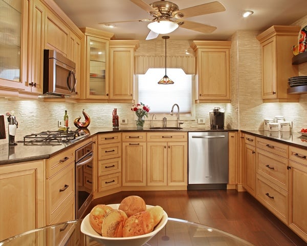
Galley kitchens are ideal for certain home layouts due to their efficient use of space. Galley kitchens work well in small homes with limited space. These kitchens provide an intimate and cozy cooking experience that is suitable for small households. These kitchen layouts are small enough to allow the user to customize the look and design of the kitchen without having to invest as much as larger kitchen footprints.
Never Block the Windows


There is a general design rule that you must never block windows, and this is an easy one to understand. After all, maximizing natural light is vital in interior spaces. This is a rule that you can break at times, but it is worth proceeding with caution. Some homeowners are extending open shelving over windows. This works well as a way to maximize your upper storage without sacrificing too much natural light. Opt for slim and organized shelves to create a design that is effective and natural.
Do Not Use Dark Colors


Many homeowners and designers prefer light and bright colors in kitchen design to amplify natural light and create a cheerful and welcoming atmosphere. While this design approach is effective for many people, it is not suitable for all. This approach fails to recognize that some homes work better with dark and moody colors that complement the overall color palette of the home.
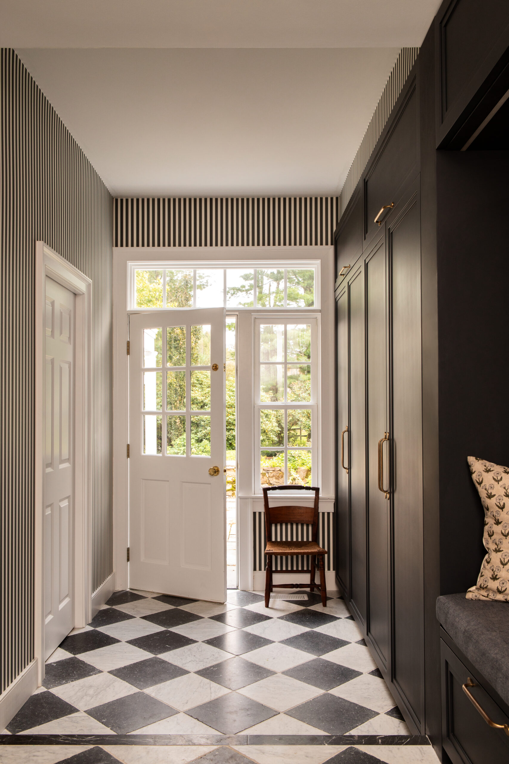
Dark colors enhance the depth, drama, and sophistication of interior spaces. They add an unexpected look to kitchens, making them both surprising and unique. Contrary to popular belief, dark colors do not make rooms appear smaller; instead, they can enhance the perceived proportions of a room. Dark colors also make an excellent backdrop for highlighting specific design elements or bright hardware, which can help make your kitchen feel more personalized. Dark shades of blue and green are especially popular today, but other colors, such as brown and black, are becoming more common.
Always Match Your Surfaces


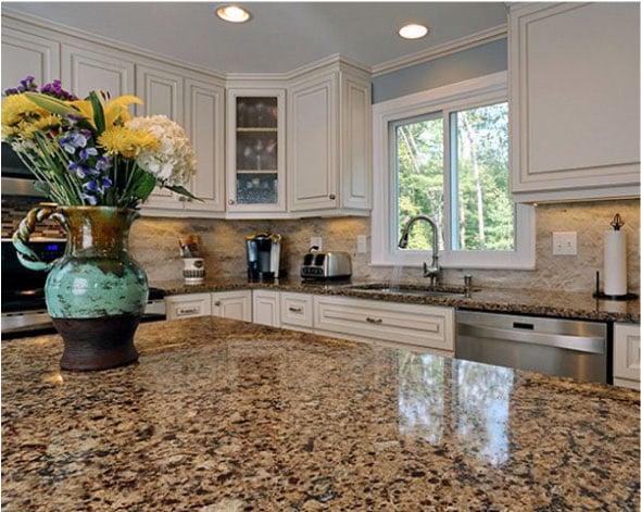
Using matching surfaces such as countertops, cabinets, hardware, and colors was once thought to be a safe way to create a cohesive and harmonious kitchen space. This approach works well in small or modern-style kitchens but can be modified in large and more eclectic kitchen designs.
Layering different colors and materials can help give your kitchen a more dynamic appearance. Different elements are being adapted by designers for specific uses, such as introducing a variety of light fixtures to facilitate work in various kitchen spaces or employing different countertop materials throughout the kitchen for specific purposes.


